Data visualisation: One of my favorite buzz words in the industry.
As a former visual designer and current information architect, I feel magnetically drawn to the art of data visualisation. To quote one of the visualisation masters of our time; Edward Tufte:
Graphical excellence consists of complex ideas communicated with clarity, precision, and efficiency. The clear portrayal of complexity leads to revelations of the complex.
Data graphics are instruments for reasoning about quantitative information. Visualizing data allows you to describe, explore, and summarise information all at once. Now that is some effective multitasking! And that is exactly what I believe to be the key benefit in all this: the ability to be able to process large amounts of information in order to reach insights quicker.
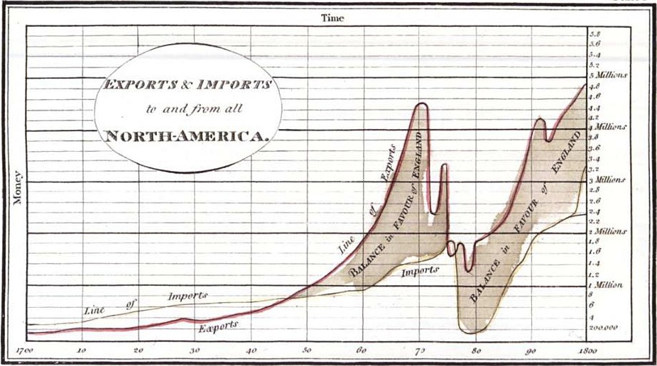
Back in the day it was common to display statistical data in a very linear fashion; difficult to read and heavy tables. Numbers and values listed down. Even today it still exists: how many of you have seen that endless excel table or long list of data that realistically no sane person would voluntarily churn through? However now we are starting to see a trend towards organisations investing in understanding how to best communicate the picture of numbers.
Why is data visualisation so important? Let’s look at the following example. Imagine a red ball being thrown through the air from point A to point B. That’s a very clear image of what is going on and in a millisecond we are able to register a large amount of information. We get a sense of the speed, the weight, the picture of what is going on. Conversely, if were to summarise that image in a statistical representation, information would include a list of values and numbers: the diameter of the ball, velocity in x direction, velocity in y direction, point A and B geographical coordinates, air friction value, force with which the ball is being thrown, weight of the ball, g-force, just to mention just a few. If I had given you a table of all that data for you to look through and then asked you to tell me what the data is showing, it wouldn’t be an easy task. It would take much longer, be much more difficult and still likely to not be as accurate as the true image itself. And with the amount of effort required to decipher the data, we end up limiting ourselves in exploring further insights of the image. Information that is imperfectly acquired is often imperfectly retained. That is where the art of data visualisation really lends itself to information processing. The closer the image is to what the data represents, the easier it is to understand and explore. Data graphics visually display measured quantities by means of the combined use of points, lines, coordinate system, numbers, symbols, words, shading, and colour.
So I will end with another quote by Edward Tufte:
Of all the methods for analysing and communicating statistical information, well-designed data-graphics are usually the simplest and at the same time the most powerful.
And here you can find the inspiration for this post:
The Visual Display of Quantitative Information